
In his blog post 2011 Updates to model-data comparisons at Real Climate, Gavin Schmidt shows the diagram in Figure 1.

Figure 1: Real World Temperatures Compared with IPCC Model Ensemble (Schmidt, 2012)
Gavin states that, “Overall, given the latest set of data points, we can conclude (once again) that global warming continues.” My perception was that there had been some cooling over the last 15 years, therefore I have decided to check Gavin’s claims.
Gavin explains that the chart shows the annual mean anomalies from the IPCC AR4 models plotted against the surface temperature records from the HadCRUT3v, NCDC and GISTEMP products (it really doesn’t matter which). Everything has been baselined to 1980-1999 (as in the 2007 IPCC report) and the envelope in grey encloses 95% of the model runs.
At first glance the chart seems to show a good correspondence between real world temperature and the average of the IPCC models. However, the correspondence does not look quite so good when you compare the chart with the AR4 charts. I have updated AR4 Figures 1.1 and TS.26 to include the HadCRUT data up to May 2012 and discuss these as follows.
Figure 2 is derived from Figure 1.1 of IPCC AR4.

Figure 2: Global Average Temperature Compared with FAR, SAR & TAR (after AR4 Figure 1.1)
It should be noted in Figure 2 that I could not get the HadCRUT3 temperature to match exactly with the values in Figure 1.1 in AR4. Therefore, I had to adjust the HadCRUT3 data by adding 0.026 °C. I am not sure why I had to make the adjustment in the HadCRUT3 data, perhaps it is just a printing error in the AR4 diagram but this error also repeats elsewhere. It may be coincidence but the average temperature for 1961-1990 on which HadCRUT3 is based is 0.026 °C. Therefore, it may be that the AR4 chart is normalised to a zero temperature for the 1961-1990 period. However, I can find no information that confirms that this adjustment should be made.
Notwithstanding the above, it is evident from Figure 2 that the correlation between the adjusted HadCRUT3 data and the original AR4 Figure 1.1 data is very good. This applies to both the individual data points and the smoothed data. It is also evident that the temperature trend is significantly below the FAR estimate and is at the very low ends of the SAR and TAR estimates.
In order to compare Gavin’s diagram with actual global temperatures, I use Figure TS.26 from AR4 a shown in Figure 3.
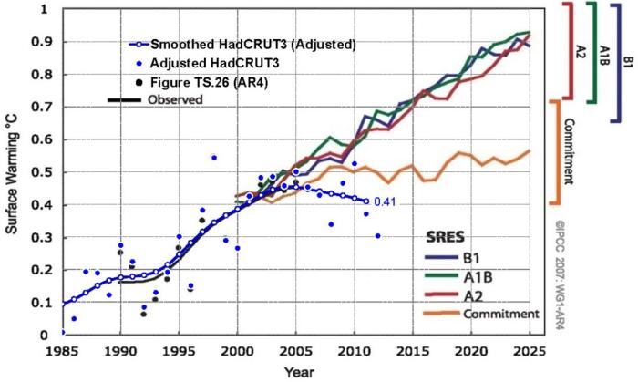
Figure 3: Model Projections of Global Mean Warming Compared with Observed Warming (after AR4 Figure TS.26)
The following points should be noted regarding Figure 3 compared with AR4 Figure TS.26:
- I have deleted the FAR, SAR and TAR graphic from Figure TS.26 in Figure 3 because they make the diagram more difficult to understand and because they are already presented in Figure 2, in a form that is much easier to assimilate.
- The temperature data shown in AR4 Figure 1.1 does not correspond to that shown in Figure TS.26. The Figure 1.1 data appear to be approximately 0.02 °C higher than the corresponding data in Figure TS.26. I have assumed that this is a typographical error. Therefore, I have used the same 0.026 °C adjustment to the HadCRUT3 data in Figure 3 that was used for Figure 2.
- My adjusted HadCRUT3 data points are typically higher than those presented in Figure TS.26.
- Despite items (1), (2) and (3) above, there is very good agreement between the smoothed data in TS.26 and the adjusted HadCRUT3 data, particularly for the 1995-2005 period. It should be noted that AR4 uses a 13-point filter to smooth the data whereas HadCRUT uses a 21-point filter. Nevertheless, AR4 states that the 13-point filter gives similar results to the 21-point filter.
Comparing Gavin’s projections in the RC chart in Figure 1 with the official AR4 projections in Figure 3, the following points are evident:
- The emissions scenarios and their corresponding temperature outcomes are clearly shown in the AR4 chart. Scenarios A2, A1B and B1 are included in the AR4 chart – scenario A1B is the business-as-usual scenario. None of these scenarios are shown in the RC chart.
- Real world temperature (smoothed HadCRUT3) is tracking below the lower estimates for the Commitment emissions scenario., i.e., emissions-held-at-year-2000 level in the AR4 chart. There is no commitment scenario in the RC chart to allow this comparison.
- The smoothed curve is significantly below the estimates for the A2, A1B and B1 emissions scenarios. Furthermore, this curve is below the error bars for these scenarios, yet Gavin shows this data to be well within the error bands.
- The RC chart shows real world temperatures compared with predictions from models that are an “ensemble of opportunity”. Consequently, Gavin states, “Thus while they do span a large range of possible situations, the average of these simulations is not ‘truth’.” [My emphasis].
In summary, TS.26 from AR4 is useful for comparing real world temperature data with the relevant emissions scenarios. To the contrary, Gavin uses a chart which compares real world temperature data with average model data for which he states does not represent “truth.” I suggest that this is not much of a comparison and I conclude that the AR4 chart is a much more informative comparison.
I also conclude that it is evident from Figure 3 (AR4 Figure TS.26) that there has been a pause in global warming and that some cooling is occurring. It is certainly not as Gavin concluded that, “Overall, given the latest set of data points, we can conclude (once again) that global warming continues.” Whether or not this cooling pause is a longer-term phenomenon or temporary pause only time will tell.